More than 60% of Australian website traffic now comes from mobile devices, according to Google’s own usability guidance and industry data from StatCounter. If your website was built for desktop screens first, there’s a good chance it’s quietly costing you customers every single day.
Think about your own habits for a moment. When you want to find a tradie, book a table, or check if a shop is open, what do you do? You pull out your phone. Your customers do exactly the same thing. And if your site is slow to load, hard to read, or awkward to tap through on a small screen, most people won’t stick around to figure it out. They’ll simply tap back and call the next business on the list.
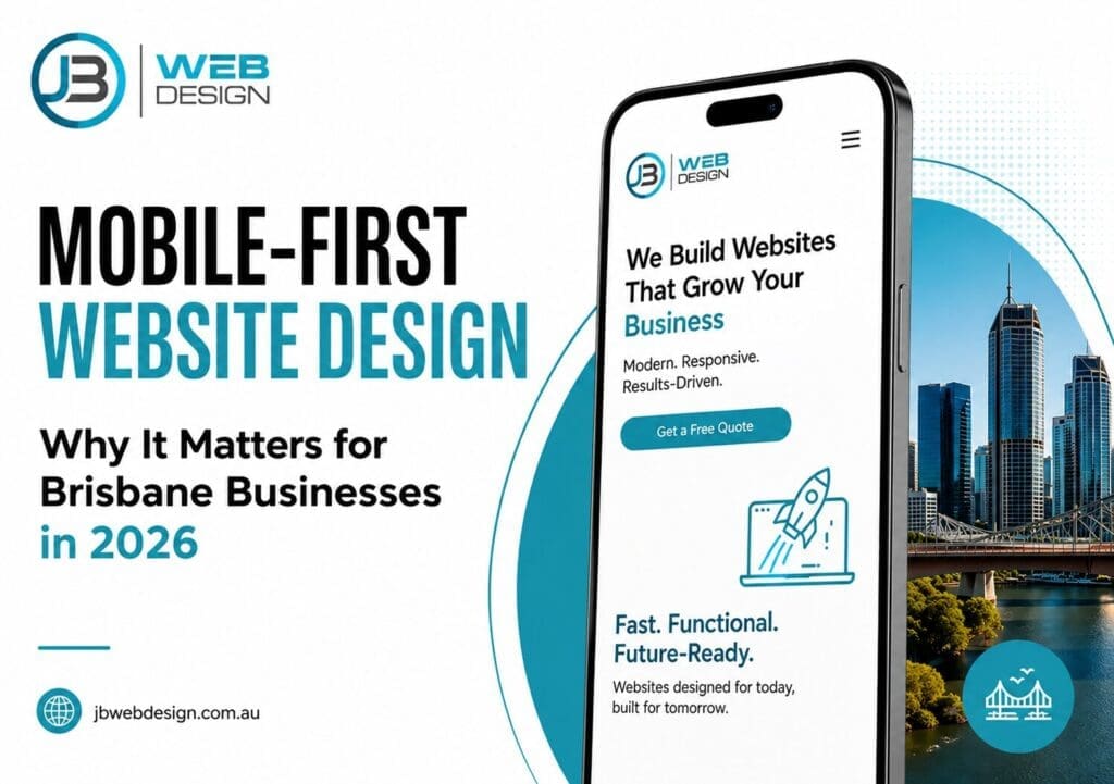
This is where mobile-first website design becomes increasingly important. Rather than treating mobile users as an afterthought, it prioritises the experience people have on their smartphones from the very beginning. As a result, businesses can deliver a more effective mobile website design that aligns with how customers browse, search, and make purchasing decisions today, particularly in a mobile-driven market like Brisbane.
Mobile-First Website Design at a Glance
- Designed for smartphone users first, then expanded for tablets and desktops
- Improves the overall user experience and page speed
- Supports Google mobile-first indexing and local SEO
- Helps lift mobile conversion rate and reduce lost enquiries
- Strengthens visibility in local search and on Google Search
- In this guide, we’ll break down what mobile-first design really means, why Google cares so much about it, and what you can do right now to check how your own website measures up.
In this guide, we’ll break down what mobile-first design really means, why Google cares so much about it, and what you can do right now to check how your own website measures up.
Mobile Website Statistics in 2026
- Over 60% of Australian web traffic comes from mobile devices
- More than 70% of local “near me” searches are now performed on mobile devices, highlighting just how often consumers rely on their smartphones to find nearby businesses, products, and services.
- Google uses mobile-first indexing to rank every website
- Mobile users tend to abandon slow-loading pages within seconds
The Numbers: How Many Brisbane Customers Browse on Mobile?
For Brisbane businesses, this isn’t an abstract statistic. It plays out in everyday scenarios:
- An emergency plumber search at 9pm, typed on a phone while standing in a flooded laundry.
- A café search in West End from someone walking down Boundary Street, hungry and deciding in seconds.
- A landscaper search in Logan from a homeowner scrolling through reviews on their lunch break.
- An electrician called from a phone because the power just went out, and the laptop won’t turn on either.
In every one of these examples, the customer is on a small screen, often on 4G, and usually in a hurry. They’re not patiently waiting for a slow site to load or pinching and zooming to find your phone number.
Key takeaway: Most Brisbane customers discover and contact local businesses through their phones, not their laptops or desktops. If your website doesn’t work well on mobile, you’re not just providing a slightly worse experience. You’re losing enquiries before they even reach you.
Quick Revenue Example
Consider a simple example. If your website attracts 1,000 visitors each month and around 70% of them (700 people) arrive via a mobile device, the majority of potential customers are experiencing your business on a smartphone. If your mobile conversion rate is even slightly lower than your desktop conversion rate due to slow load times, difficult navigation, or other usability issues, that gap can result in a significant number of missed enquiries over time. Across a year, those lost opportunities can have a measurable impact on revenue, highlighting why mobile performance is a business consideration rather than simply a user experience concern.
What “Mobile-First” Actually Means (It’s More Than Just Responsive)
What Is Mobile-First Website Design?
Mobile-first website design is an approach where a website is designed for smartphones first, then expanded for larger screens such as tablets and desktops. Instead of building a full desktop site and then squeezing it down to fit a phone, designers start with the smallest screen and build up from there.
This might sound like a small difference, but it changes almost everything about how a site is built, from the images used, to the menu structure, to how fast the page loads.
What Is Website Mobile Optimisation?
Website mobile optimisation is the ongoing process of fine-tuning a site’s speed, layout, and usability specifically for smartphone users. This includes things like compressing images, simplifying navigation, and making sure buttons and forms are easy to use on a touchscreen. A mobile-first design gives you a strong starting point, but mobile optimisation is what keeps the experience sharp as content, traffic, and devices change over time.
What Is Mobile Website Design?
Mobile website design refers to how a website’s layout, content, and features are designed and arranged specifically for viewing and use on a mobile device. It covers everything the visitor sees and touches on their phone, from font size and image placement to button spacing and menu structure. Good mobile website design is the visible result of a solid mobile-first approach combined with ongoing mobile optimisation.
Responsive vs Mobile-First Design
These two terms get used interchangeably, but they’re not quite the same thing.
| Responsive Design | Mobile-First Design | |
|---|---|---|
| Starting point | Desktop layout | Mobile layout |
| Approach | Scales down for smaller screens | Builds up for larger screens |
| Typical result | Often carries unnecessary “weight” from desktop | Leaner, faster, simpler by default |
| Performance on phones | Can be sluggish despite looking fine | Optimised from the ground up |
Many businesses still rely on a responsive web design Brisbane agencies built several years ago. At the time, “responsive” was the gold standard. The problem is that their site is technically responsive (it doesn’t look broken on a phone) but it still feels slow and clunky to use. This happens because of what’s sometimes called the “desktop baggage” problem.
A responsive site is usually built for desktop first, with large background images, complex animations, and heavy code designed to fill a big screen. When that same site is squeezed down to fit a phone, all that extra weight comes along for the ride. The layout might fit, but the page still has to load all those images and scripts in the background. This is exactly why so many “mobile-friendly” sites still feel slow on a 4G connection, and why a simple responsive web design Brisbane fix often isn’t enough on its own.
A true mobile-first site avoids this altogether by designing lean from the start, then adding extra detail for bigger screens, not the other way around.
Responsive vs Mobile-First vs Mobile-Optimised
| Feature | Responsive | Mobile-First | Mobile-Optimised |
|---|---|---|---|
| Starts with mobile | No | Yes | Depends on the build |
| Fast on 4G | Sometimes | Usually | Usually |
| Supports SEO | Yes | Better | Better |
| User experience | Good | Excellent | Excellent |
In short, mobile-first website design gives you the strongest foundation, and ongoing mobile optimisation is what keeps that foundation performing well over time.
Understanding Google Mobile-First Indexing and Its Impact on Search Rankings
What Is Google Mobile-First Indexing?
Google mobile-first indexing is the process where Google’s search engine uses the mobile version of your site as the primary basis for indexing and ranking. In plain English: even if a business owner only ever checks their website on a desktop computer, Google is judging the site based on how it performs on a phone. If your mobile site is slow, hard to navigate, or missing content that’s present on desktop, that’s the version Google uses to decide where you appear in search results.
This matters enormously for local SEO and for how your business shows up alongside your Google Business Profile. When someone searches for a service “near me,” Google is weighing up dozens of signals, including page speed, user experience (UX), and overall mobile search traffic patterns. A poor mobile experience can quietly push you down the list, even if your desktop site looks great.
Core Web Vitals: The Technical Side, Explained Simply
Google measures mobile performance using a set of metrics called Core Web Vitals. They sound technical, but the ideas behind them are simple, and they all tie back to mobile-first website design fundamentals.
| Metric | What It Measures | Target |
|---|---|---|
| LCP (Largest Contentful Paint) | How quickly the main content of your page loads | Under 2.5 seconds |
| INP (Interaction to Next Paint) | How quickly your site responds when someone taps a button or link | Under 200 milliseconds |
| CLS (Cumulative Layout Shift) | How much your page “jumps around” while loading | Under 0.1 |
- LCP is essentially: how long does someone wait before they can actually see and read your page?
- INP is: when I tap something, does it respond instantly, or does it feel laggy and frustrating?
- CLS is: does the page stay still while it loads, or do buttons and text jump around just as I try to tap them?
If any of these are poor on your mobile site, it can affect both your search rankings and how trustworthy your business appears to visitors. A site built around mobile-first website design principles tends to score well on all three by default, simply because it was never weighed down with desktop-first baggage in the first place.
6 Common Mobile Design Failures That Cost You Customers
Here are the most common issues we see on Brisbane business websites, and how each one quietly chips away at your leads.
1. Slow Load Times
Problem: The page takes more than a few seconds to load on 4G.
User frustration: People expect near-instant results. Every extra second feels like an eternity when you’re standing in the rain trying to find a locksmith.
Lost conversion: The visitor leaves before the page even finishes loading, and clicks straight onto a competitor in the search results. This is one of the most common reasons mobile conversion rate sits well below desktop on older sites.
2. Tiny Buttons
Problem: Buttons, menu items, and links are too small to tap accurately.
User frustration: Fat-finger taps lead to the wrong page, or no response at all. As a rough guide, tap targets should be at least 44×44 pixels, roughly the size of a fingertip, so they’re easy to hit accurately.
Lost conversion: Frustrated users give up rather than fight with fiddly buttons. Good mobile-first website design treats button sizing as a basic requirement, not an afterthought.
3. Difficult Navigation
Problem: Complex menus with too many options, or navigation that simply doesn’t work well on a touchscreen.
User frustration: Visitors can’t find what they’re looking for, your services, your pricing, your contact details, within a couple of taps.
Lost conversion: A simple, clean hamburger menu (the three-line icon in the corner) with clearly labelled options keeps mobile navigation easy and predictable.
4. Non-Clickable Phone Numbers
Problem: Your phone number is displayed as text, but tapping it doesn’t do anything.
User frustration: The visitor has to manually copy the number, switch to their phone app, and dial. That’s an unnecessary extra step most people won’t bother with.
Lost conversion: With click-to-call set up correctly, tapping your number opens the dialler immediately, ready to go. This one small fix can make a real difference to enquiry numbers.
5. Long Contact Forms
Problem: Forms ask for too much information: name, address, phone, email, business details, and a lengthy message box.
User frustration: Typing on a phone keyboard is slow and fiddly. Long forms feel like a chore.
Lost conversion: Visitors abandon the form halfway through. Shorter forms that use autofill and ask only for essentials (name, phone, brief message) convert far better.
6. Missing Trust Signals
Problem: No reviews, no licence numbers, no real photos of past work, just stock images and generic text.
User frustration: On a small screen, people make snap judgements about whether a business looks legitimate and local.
Lost conversion: Without visible Google Reviews, trade licences, or real project examples near the top of the page, visitors aren’t confident enough to make contact, even if your work is excellent.
How to Test Your Website’s Mobile Performance and Usability
What Is a Mobile Usability Test?
A mobile usability test is a simple check of how easy your website is to use on a smartphone, covering things like load speed, button size, navigation, and form usability. You don’t need to be technical to run one. Grab your phone, pull up your own website, and work through the checklist below.
Mobile Usability Test Checklist
Can you:
- Load the page quickly on 4G, without staring at a blank screen for several seconds?
- Tap buttons and menu items easily with one thumb, without zooming in first?
- Tap your phone number and have it dial automatically (click-to-call)?
- Fill out your contact form in under a minute, without it feeling like a chore?
- Read the text clearly without needing to pinch and zoom?
- Navigate the whole site with one hand, the way most people actually hold their phone?
If you answered “no” or “not really” to two or more of these, there’s a strong chance your website is leaving enquiries on the table. The good news is that most of these issues are fixable without rebuilding your entire site from scratch, though for older sites, a proper mobile-first rebuild often delivers the best long-term results.
Quick Self-Assessment
If your website:
- Loads slowly on mobile
- Has tiny buttons or links that are hard to tap
- Uses long, fiddly contact forms
- Doesn’t support click-to-call
- Has poor visibility for Google Reviews
Then it may be time for a professional mobile usability review. Even small fixes in these areas tend to have an outsized effect on enquiry numbers, simply because they remove friction at the exact moment someone is ready to contact you.
Need a Second Opinion?
Not sure whether your website passes the test above? JB Web Design can review your site’s mobile performance and flag the common issues affecting speed, usability, and conversions, with no obligation attached.If you’d like a professional assessment of your website’s mobile experience, request a quote and we’ll help identify any issues that may be affecting usability and performance.
What a Properly Mobile-Optimised Site Looks Like
So what does “good” actually look like in practice? A genuinely mobile-optimised website tends to share these features.
Fast Loading Pages appear almost instantly, even on a patchy 4G connection. No spinning icons, no long blank pauses.
Sticky Calls-To-Action A “Call Now” or “Get a Quote” button stays visible at the bottom of the screen as the visitor scrolls, so contacting you is always just one tap away.
Thumb-Friendly Navigation Menus and buttons are placed where thumbs naturally rest, with clear spacing so nothing gets tapped by accident.
Click-To-Call Buttons Phone numbers are fully clickable, opening the dialler instantly.
Mobile-Optimised Forms Short, simple forms with autofill support, so enquiries take seconds rather than minutes.
Strong Local Trust Signals Google Reviews, licences, and real photos of completed work are visible early on the page, not buried at the bottom.
This kind of mobile website design isn’t about making things look pretty on a small screen. It’s about designing around how people actually behave: quickly, on the go, and often under some kind of time pressure. Every part of this, from page speed to button placement, feeds directly back into a stronger mobile conversion rate.
Benefits of Mobile-First Website Design for Brisbane Businesses
Investing in mobile-first website design isn’t about chasing trends. It’s about aligning your website with how your customers already behave, and with how Google evaluates your site in search. For most local businesses, this also means investing in mobile website design that holds up under everyday conditions, not just on a designer’s test phone.
The potential benefits include:
- More enquiries, simply because fewer visitors give up out of frustration
- A better overall user experience (UX), which reflects well on your brand
- Improved search rankings, thanks to stronger Core Web Vitals and Google mobile-first indexing
- Increased trust, with visible reviews, licences, and real project examples
- Future-proofing, as mobile search traffic continues to grow rather than shrink
While results vary depending on your industry, starting point, and how the changes are implemented, businesses that move from a clunky responsive site to a true mobile-first design commonly see meaningful improvements in mobile conversion rate, often somewhere in the range of 30 to 60%, according to UX research summarised by sources such as Think with Google. As always, results depend on your specific situation, so it’s worth treating this as a realistic possibility rather than a guarantee.
How JB Web Design Helps Brisbane Businesses Build Mobile-First Websites
At JB Web Design, we’ve spent over 15 years working with Australian businesses, including Brisbane trades, professional services, retailers, and hospitality operators. After auditing a huge range of local business websites over that time, the same mobile issues come up again and again: slow load times, awkward navigation, and missed click-to-call opportunities.
Our approach to website mobile optimisation focuses on the fundamentals: fast load times, clean navigation, click-to-call functionality, and forms that are quick to complete, all built on an SEO-first foundation so your site is set up to perform well in Google mobile-first indexing from day one. The result is mobile website design that looks good and actually works for the people using it.
Whether you need a custom website design built from the ground up, or you’re not sure whether your current site needs a refresh or a full rebuild, we’re happy to take a look and give you honest, practical advice, with transparent pricing and no pressure to sign up for ongoing contracts.
FAQ
Key Takeaways
- Mobile traffic now dominates customer behaviour for Brisbane businesses.
- Responsive and mobile-first are not the same thing, and the difference matters for speed.
- Google ranks websites primarily on their mobile version through mobile-first indexing.
- Mobile usability issues directly affect your mobile conversion rate and your bottom line.
- Small, targeted mobile improvements often generate a noticeable lift in enquiries.
Final Thoughts: What Is Mobile-First Website Design?
Mobile traffic isn’t a trend that’s going to reverse. It’s simply how most people in Brisbane now search, browse, and decide who to contact. Google evaluates your site primarily through its mobile performance, and a clunky mobile experience doesn’t just frustrate visitors, it can actively push you down the search results too.
The encouraging part is that most mobile issues are identifiable with a quick test on your own phone, and fixable with the right approach.
Ready to improve your website’s mobile performance? Explore our custom website design services or get a quote from the JB Web Design team. We’re happy to take a practical, honest look at where your site stands today.

Alex Morgan brings over 8 years of experience in website development and digital marketing, specializing in SEO‑optimized content strategy, conversion‑focused copywriting, and local business growth for clients across Brisbane and Australia.
Based in Brisbane, Alex holds a certification in Google Analytics and has led campaigns that increased organic traffic by an average of 45 % for small‑to‑medium enterprises.
When not crafting data‑driven content strategies, Alex enjoys hiking the D’Aguilar Range and mentoring aspiring marketers through workshops at the Brisbane Digital Hub.